- Log inorCreate an account
-
$0
- Item(s) in your cart
-

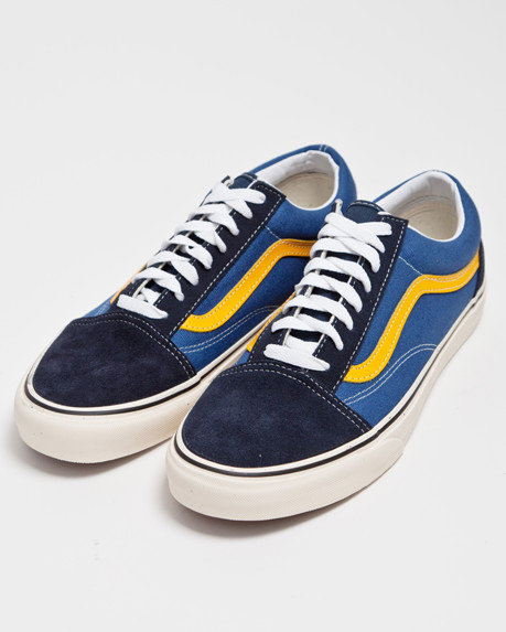
INCIDIDUNT UT
2 X $199 -
INCIDIDUNT UT
2 X $199 -
Elements
Cards <> show code
		<!-- Default Card style -->
		<div class="card">
		  <div class="card_img">
			<a href=""><img class="img-full" src="..." alt="Card image"></a>
		  </div>
		  <div class="card-block">
			<a href="#"><h3 class="card-title">Card title</h3></a>
			<span>tagline</span>
			<p class="card-text">Lorem ipsum dolor sit amet, consectetur adipisicing elit sed do eiusm tempor</p>
			<a href="" class="btn btn-primary">Read more</a>
		  </div>
		</div>

		<!-- image in the middle -->
		<div class="card img-mid">
		  <div class="card-block">
			<a href="#"><h3 class="card-title">Card title</h3></a>
			<span>card tagline</span>
			<div class="card_img">
				<a href=""><img class="img-full" src="..." alt="Card image"></a>
			</div>
			<p class="card-text">Lorem ipsum dolor sit amet, consectetur adipisicing elit sed do eiusm tempor</p>
			<a href="" class="btn btn-primary">Read more</a>
		  </div>
		</div>

		<!-- image at the bottom -->
		<div class="card img-bottom">
		  <div class="card-block">
			<a href="#"><h3 class="card-title">Card title</h3></a>
			<span>card tagline</span>
			<p class="card-text">Lorem ipsum dolor sit amet, consectetur adipisicing elit sed do eiusm tempor</p>
			<a href="" class="btn btn-primary">Read more</a>
		  </div>
		  <div class="card_img">
			<a href=""><img class="img-full" src="..." alt="Card image"></a>
		  </div>
		</div>

		<!-- Overlay contents on image -->
		<div class="card card-inverse">
		  <img class="card-img" src="img/blog/card.jpg" alt="Card image">
		  <div class="card-img-overlay">
			<h3 class="card-title">Card with overlay</h3>
			<p class="card-text">Lorem ipsum dolor sit amet, consec tetur adipisicing elit sed.</p>
		  </div>
		</div>
How to use
Card is a super content container in bootstrap 4. Here’s how to use it:
- Wrap all content in the .card wrapper
- Use .card_img as image wrapper
- By default card image are top aligned. For middle and bottom aligned image use .img-mid and .img-bottom with .card
- The .card-inverse sets an overlay on image. The contents should be wrapped into .card-img-overlay
Example:

Card title
Sub-titleLorem ipsum dolor sit amet, consectetur adipisicing elit sed do eiusm tempor
Read moreCard title
Sub-title
Lorem ipsum dolor sit amet, consectetur adipisicing elit sed do eiusm tempor
Read moreCard title
Sub-titleLorem ipsum dolor sit amet, consectetur adipisicing elit sed do eiusm tempor
Read more
Card Deck <> show code
	<div class="card-deck">
	  <div class="card">
		<div class="card_img">
			<a href=""><img class="img-full" src="img/gallery/g1.jpg" alt="Card image"></a>
		</div>
		<div class="card-block">
		  <a href="#"><h3 class="card-title">Card title</h3></a>
		  <span>by <span><a href="" class="text-primary" >Admin</a> </span></span> | <span><a href="">0  Comts</a></span>
		  <p class="card-text">Lorem ipsum dolor sit amet, consectetur adipisicing elit sed do eiusm tempor</p>
		  <a href="" class="btn btn-primary">Read more</a>
		</div>
	  </div>
	 <div class="card">
	   <div class="card_img">
		<a href=""><img class="img-full" src="img/gallery/g1.jpg" alt="Card image"></a>
	   </div>
	   <div class="card-block">
		 <a href="#"><h3 class="card-title">Card title</h3></a>
		 <span>by <span><a href="" class="text-primary" >Admin</a> </span></span> | <span><a href="">0  Comts</a></span>
		 <p class="card-text">Lorem ipsum dolor sit amet, consectetur adipisicing elit sed do eiusm tempor</p>
		 <a href="" class="btn btn-primary">Read more</a>
	   </div>
	 </div>
	  <div class="card">
		<div class="card_img">
			<a href=""><img class="img-full" src="img/gallery/g1.jpg" alt="Card image"></a>
		</div>
		<div class="card-block">
		  <a href="#"><h3 class="card-title">Card title</h3></a>
		  <span>by <span><a href="" class="text-primary" >Admin</a> </span></span> | <span><a href="">0  Comts</a></span>
		  <p class="card-text">Lorem ipsum dolor sit amet, consectetur adipisicing elit sed do eiusm tempor</p>
		  <a href="" class="btn btn-primary">Read more</a>
		</div>
	  </div>
	</div>
How to use
- Wrap all card contents in .card-deck wrapper. Each of the cards in card deck uses base card styles
Example:
Card title
Sub-titleLorem ipsum dolor sit amet, consectetur adipisicing elit sed do eiusm tempor
Read more
Card title
Sub-titleLorem ipsum dolor sit amet, consectetur adipisicing elit sed do eiusm tempor
Read more
Card title
Sub-titleLorem ipsum dolor sit amet, consectetur adipisicing elit sed do eiusm tempor
Read moreCard Ribbons <> show code
	<div class="card card-body text-center">
      <div class="card-ribbon card-ribbon-top card-ribbon-left bg-primary text-white">Popular</div>
      <h4 class="card-title">
        Ribbon
      </h4>
      <p class="card-text">With supporting text below as a natural lead-in to additional content.</p>
      <a href="#" class="btn btn-sm mt-3 btn-primary">Go somewhere</a>
    </div>

	<!-- top right -->
    <div class="card-ribbon card-ribbon-top card-ribbon-right bg-faded ">Best Value</div>

    <!-- bottom left -->
    <div class="card-ribbon card-ribbon-bottom card-ribbon-left bg-info text-white">popular</div>

    <!-- bottom right -->
	<div class="card-ribbon card-ribbon-bottom card-ribbon-right bg-primary text-white">Best Value</div>
How to use
- use the .card-ribbon wrapper inside the .card and use the following classes for proper positioning
Example
Ribbon
With supporting text below as a natural lead-in to additional content.
Go somewhereRibbon
With supporting text below as a natural lead-in to additional content.
Go somewhereCard Styles <> show code
	<div class="card text-white bg-primary mb-3" style="max-width: 20rem;">
	  <div class="card-header">Header</div>
	  <div class="card-body">
	    <h4 class="card-title">Primary card title</h4>
	    <p class="card-text">Some quick example text to build on the card title and make up the bulk of the card's content.</p>
	  </div>
	</div>
How to use
- Use any background color to .card or color classes with it. Examples uses the contextual classes.
Background color
Primary
Some quick example text to build on the card title and make up the bulk of the card's content.
Secondary
Some quick example text to build on the card title and make up the bulk of the card's content.
Success
Some quick example text to build on the card title and make up the bulk of the card's content.
Danger
Some quick example text to build on the card title and make up the bulk of the card's content.
Warning
Some quick example text to build on the card title and make up the bulk of the card's content.
Info
Some quick example text to build on the card title and make up the bulk of the card's content.
Light
Some quick example text to build on the card title and make up the bulk of the card's content.
Dark
Some quick example text to build on the card title and make up the bulk of the card's content.
© 2017 Copyright Bigbag Store Bootstrap Template by Abdus.